
Rolex Introduces Deconstructed Roman Numerals on the Datejust 36 & 41

If you are a fan of Rolex, you have probably noticed that Roman numeral dials have always had a special place in the collection. The Roman numeral dial gives the watch a vintage, classic character that a lot of people love. Many collectors are drawn to this dial style for its timeless dress watch appeal.
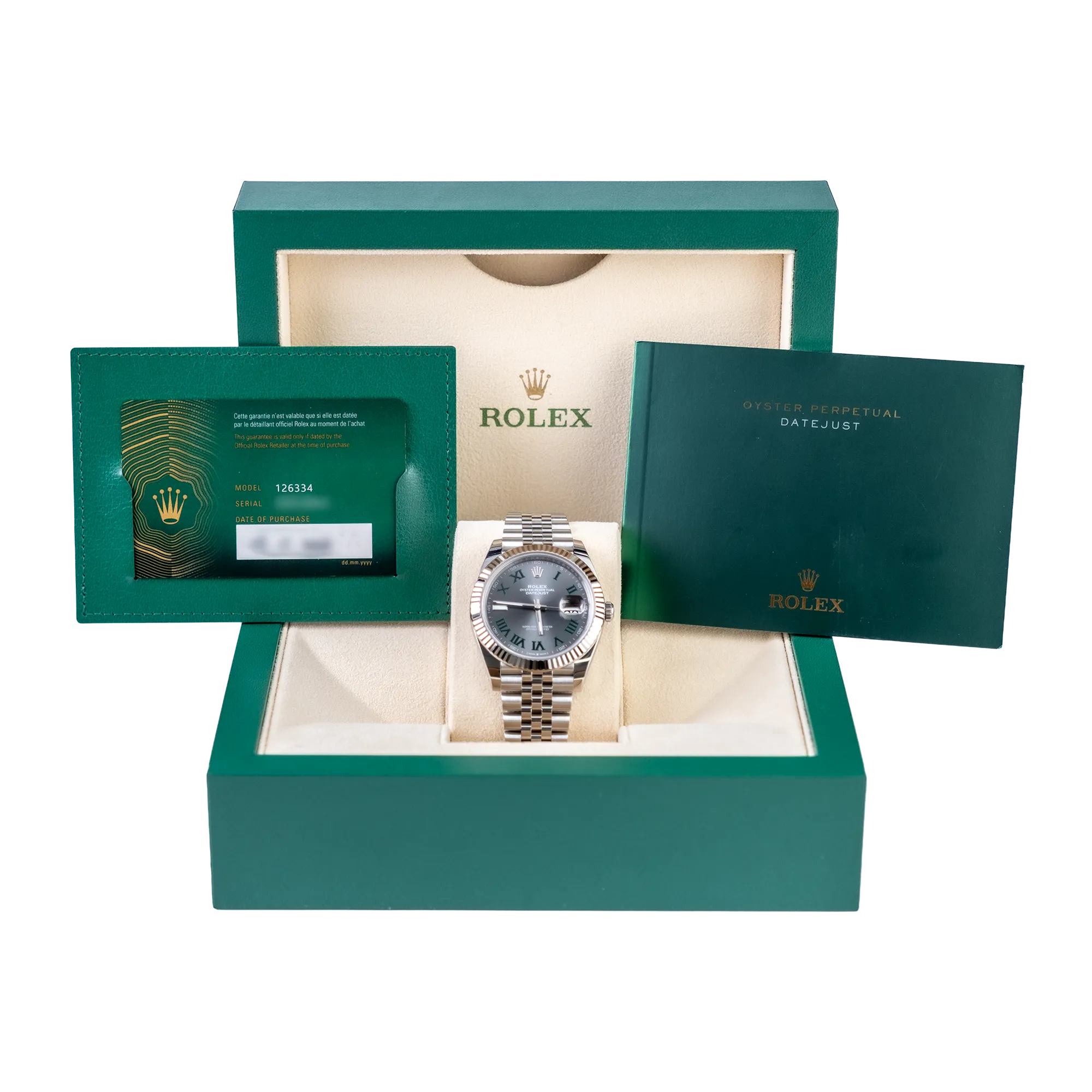
At Watches & Wonders 2026, Rolex made a quiet but interesting update. They refreshed the Roman numeral font on the Datejust 36 and Datejust 41.
The Classic Serif Roman Numeral
Roman numeral dials have been part of both the Rolex Datejust and presidential Day-Date collections for a long time. It is one of the most recognizable dial styles in the Rolex lineup.
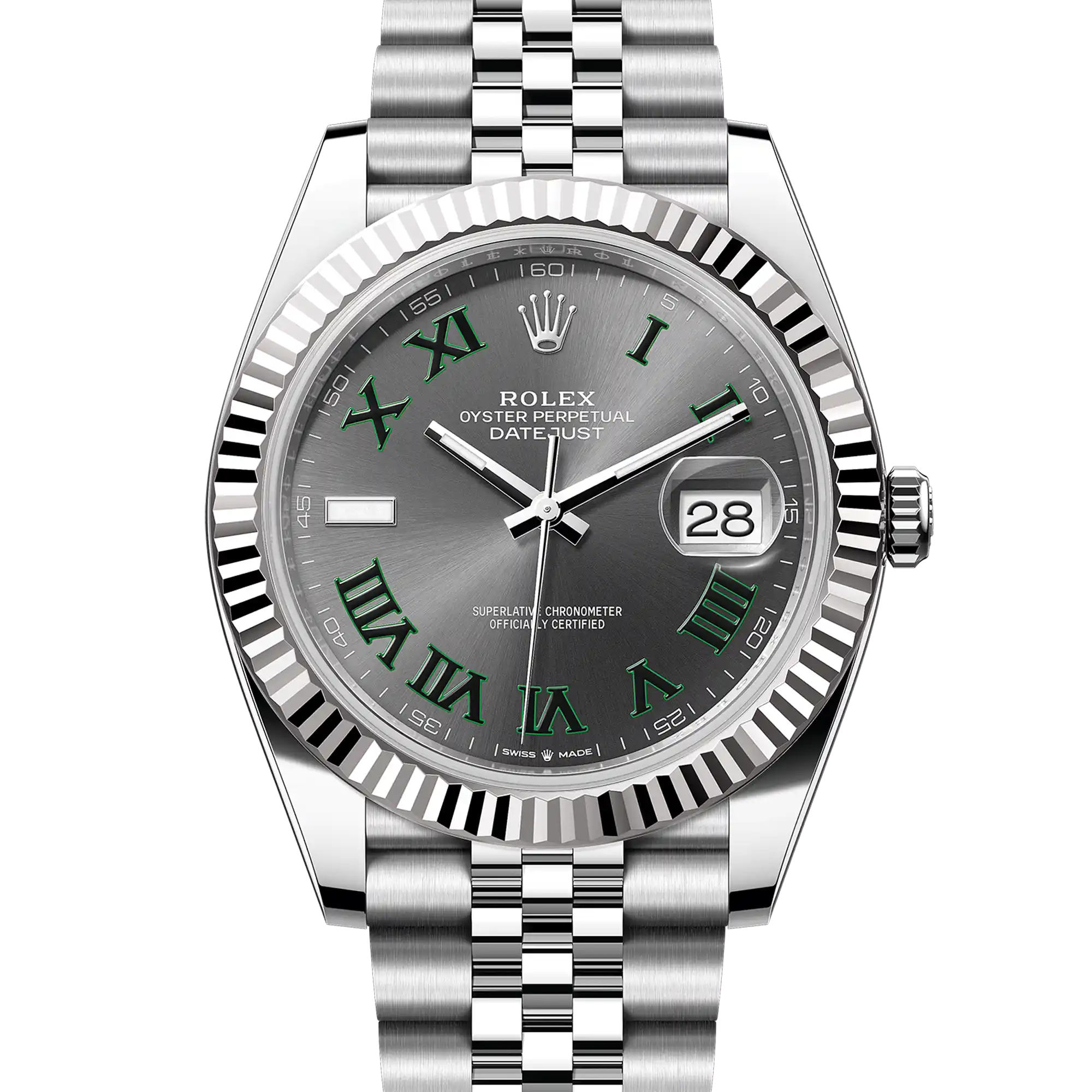
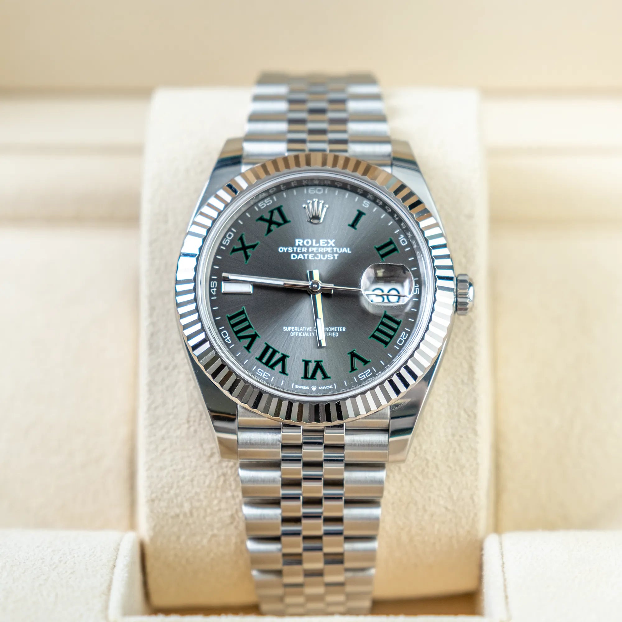
On the Rolex Datejust 36 and 41, the Roman numeral font that was used is called the classic serif style. If you look closely at the numerals, you will notice small feet at the edges of each stroke. They give the font a traditional, formal look, and that is a big part of why so many people love it.
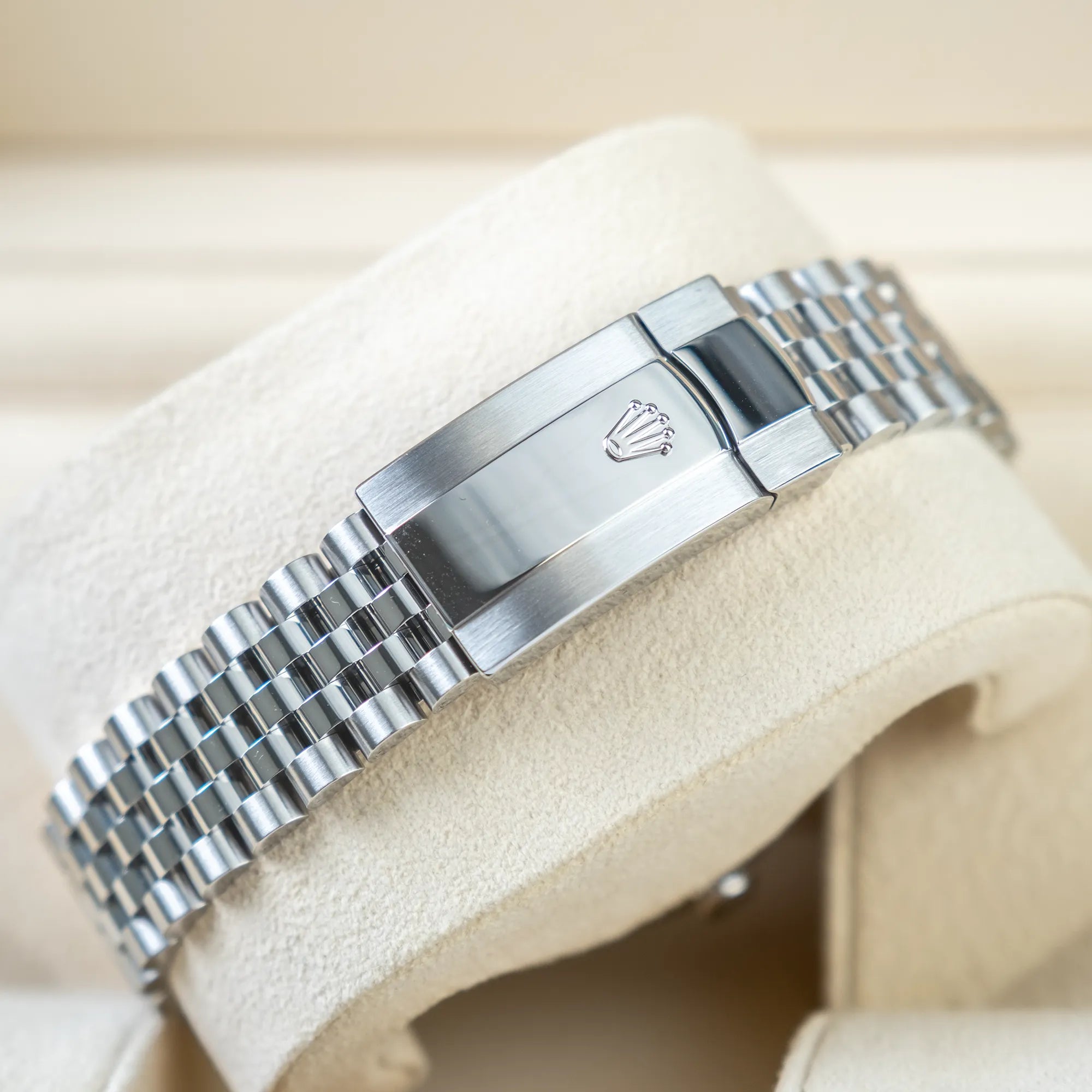
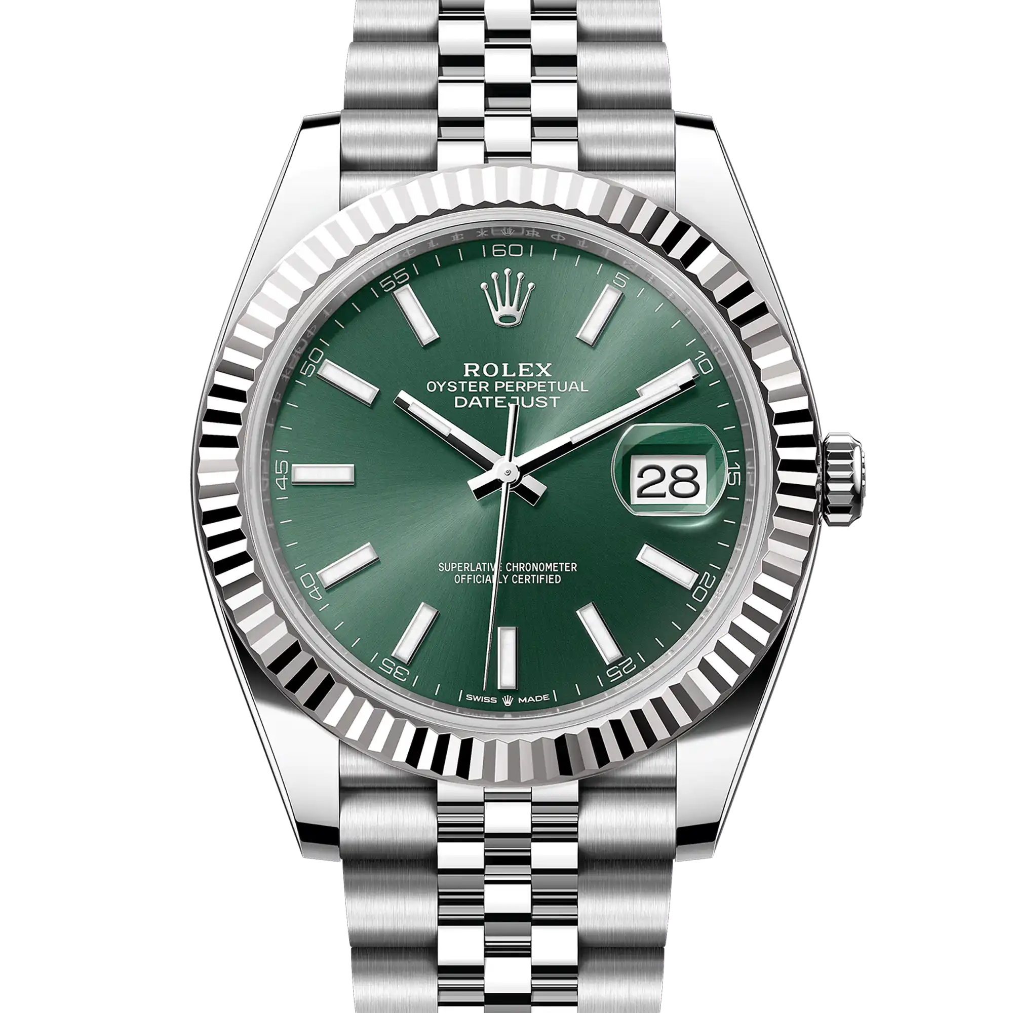
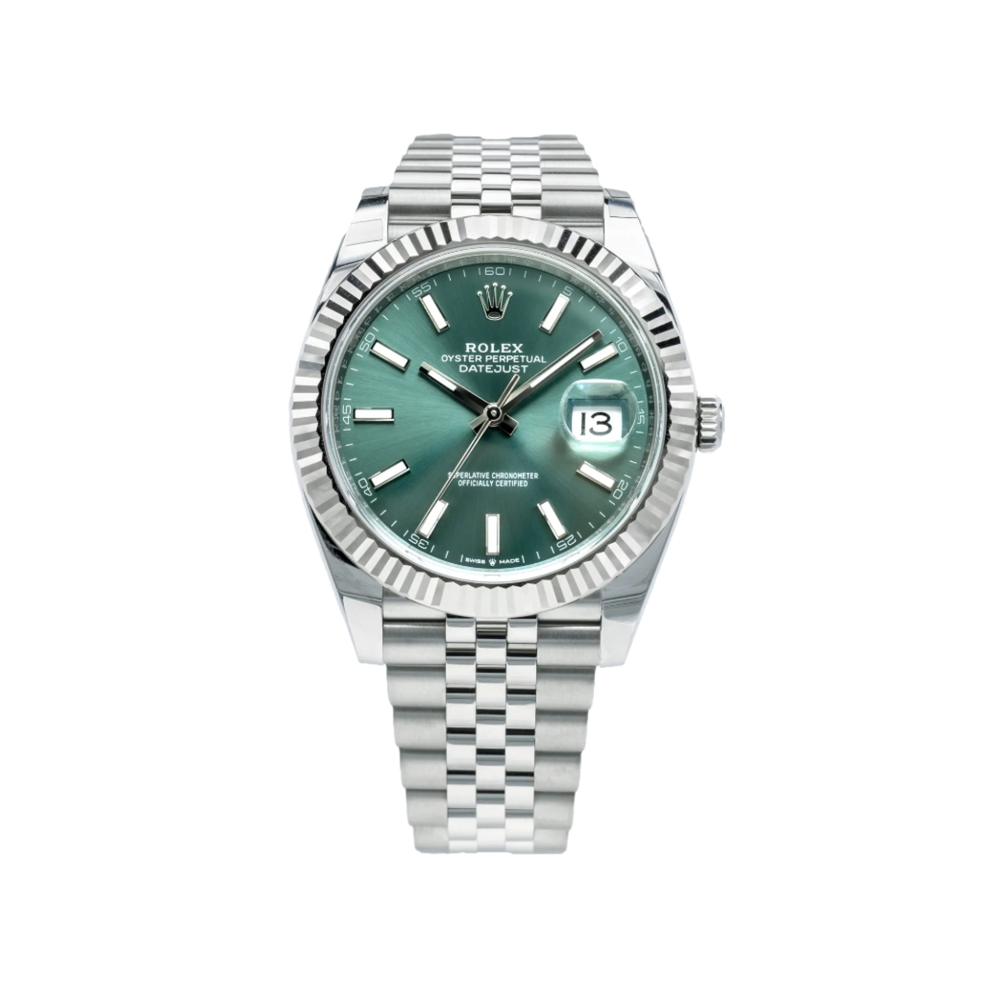
The Roman numeral dial is available across all Rolex Datejust sizes. That includes the ladies' 28mm, the unisex 31mm and 36mm, and the larger 41mm. So no matter what size you are looking at, there is a Roman numeral option for you.
One of the most popular Roman numeral dials in the Rolex Datejust collection is the Wimbledon dial. It is known for its beautiful green and grey tones paired with the classic serif Roman numerals. It is a fan favorite, and it is worth noting that the Datejust Wimbledon dial is not part of this update. It keeps its classic serif font as is.

Classic Serif font vs "Deconstructed" Roman Numeral font
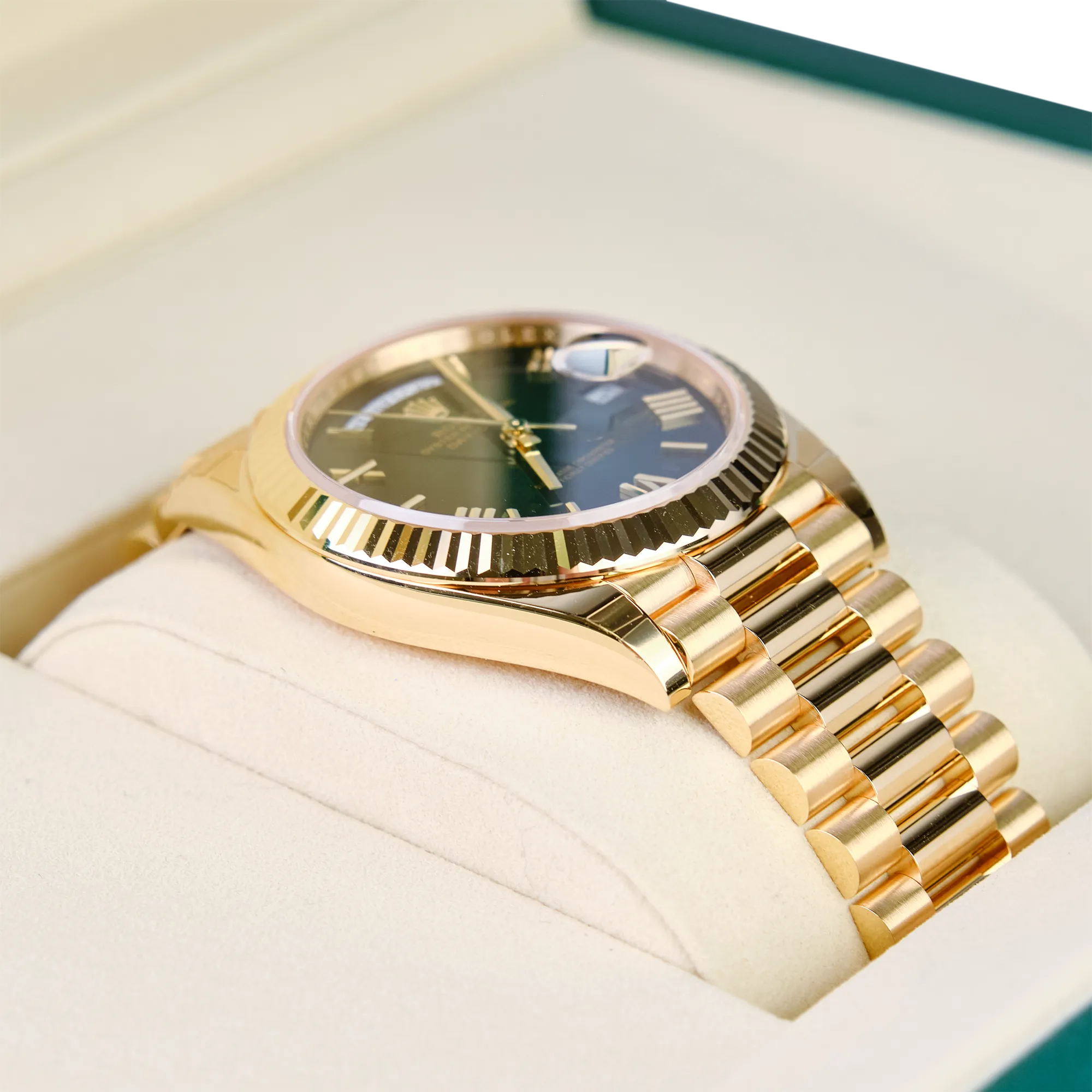
The Update: The Rolex "Deconstructed" Roman Numeral
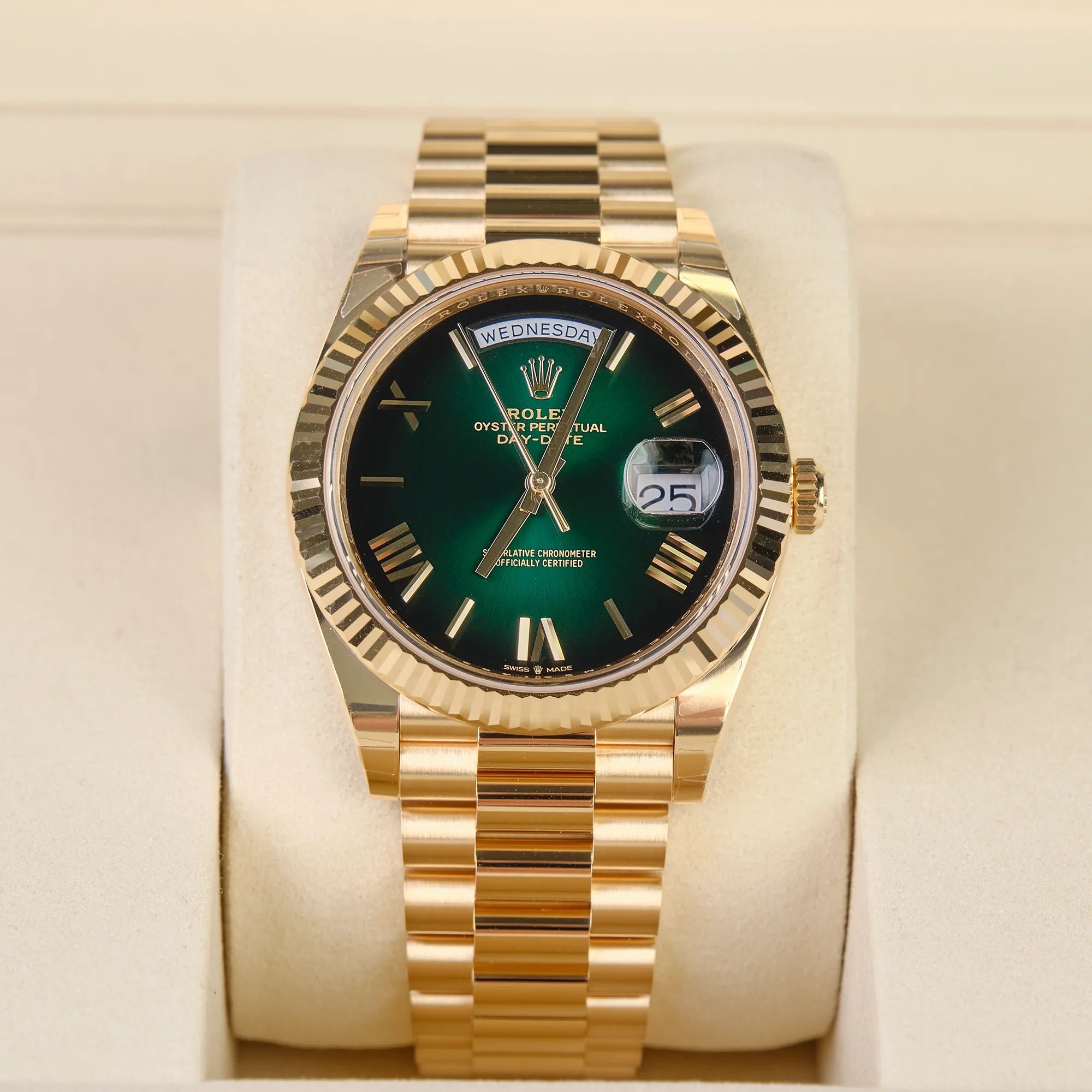
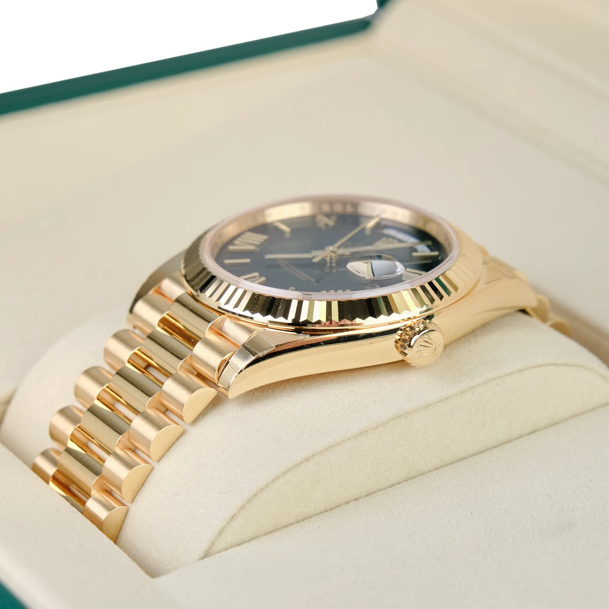
So what exactly did Rolex change? On the Rolex Datejust 36 and Datejust 41, Rolex replaced the classic serif Roman numeral font with a new style. This new font is called the Deconstructed Roman Numeral.
The name might sound complicated, but it is actually pretty simple to understand. Remember those small feet on the classic serif font? The Deconstructed style removes them completely. The result is a cleaner, simpler, more modern-looking numeral. No extra details, no small decorative strokes. Just the numeral itself.
The classic serif font feels traditional and elegant. The new Deconstructed font feels clean and contemporary. Both are beautiful, but they give the watch a very different personality.
The numerals are also placed radially around the dial, which means they follow the curve of the watch face. It gives the dial a very balanced and polished look.
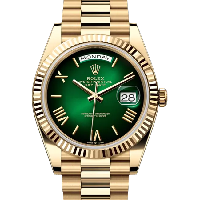
It is also worth mentioning that this font is not entirely new to Rolex. The Deconstructed Roman numeral had already been used on the Presidential Day-Date collection before it made its way to the Datejust. So in a way, Rolex brought one of the Day-Date's design elements over to the Datejust.

Rolex Datejust Wimbledon Dial
Rolex Datejust vs. Day-Date: Spot the Difference
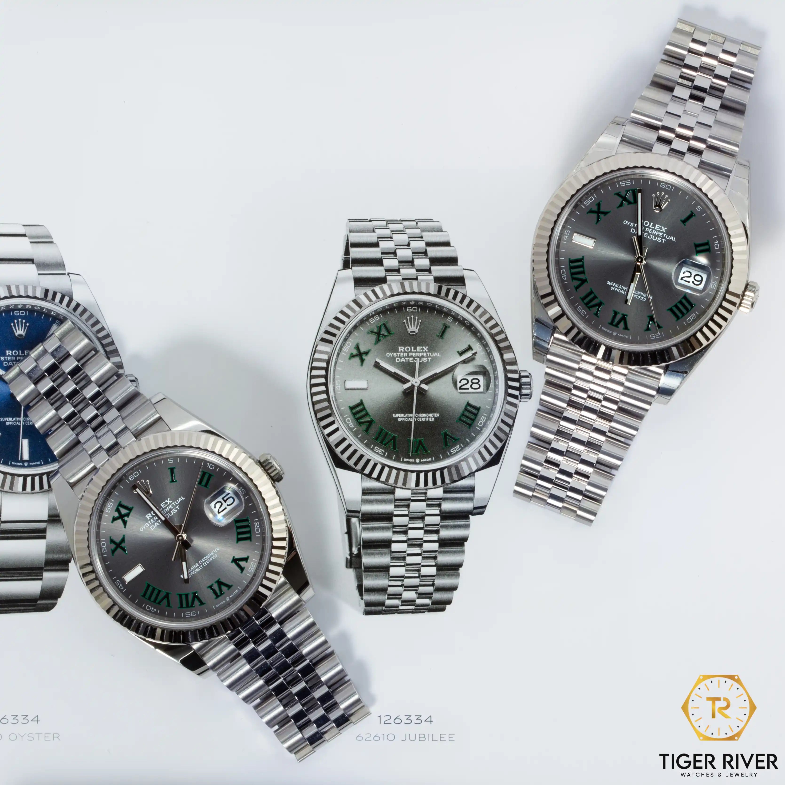
Now that both the Rolex Datejust 36 and 41 sizes and Presidential Day-Date share the Deconstructed Roman numeral font, you might be wondering if the two dials are the same. The answer is no, and here is why.
On the Presidential Day-Date, not every position on the dial uses a Roman numeral. Specifically, the positions at 1, 5, 7, 9, and 11 o'clock use stick or baton markers instead of numerals. The Deconstructed Roman numerals only appear at the remaining positions.
On the new Rolex Datejust, the Roman numerals go all the way around the dial. There are no baton markers at all. Every hour position is marked with a Deconstructed Roman numeral. This makes the Datejust version a more complete Roman numeral dial.
There is one more difference worth knowing. On the Rolex Datejust, the Deconstructed font is only available on the 36 and 41 sizes. Other dials like the Datejust Wimbledon keep the classic serif font. On the Rolex Day-Date, however, the Deconstructed Roman numeral is applied across all sizes in that collection.

Roman Numeral font in Rolex Datejust vs Rolex Day-Date
Final Thoughts
Personally, I really like this new direction. The Deconstructed Roman numeral feels modern and fresh. It is a great option for someone who loves the classic Roman numeral look but wants something that feels a little more up to date.
That said, it is still early days. It will be interesting to see how the market and collectors respond to this update over time. Some people will always prefer the classic serif, and that is completely understandable. Both styles have their own charm.
What do you think about the new Deconstructed Roman numeral on the Rolex Datejust collection? Drop your thoughts in the comments below. Would love to hear from you!